
I designed a watermark
The title is pretty self-explanatory and here is how the story goes. I needed something to put on my photo-quotes, something like a watermark or signature. Saw some interesting ones out there – basic but eye capturing. And the hard work started, to make a design same as those.
The powerful Adobe Photoshop? Well, it would have been good for sure, but it has way too many options. And I am no designer. So, I opted for the alternative Paint.NET. To introduce it, you can take Paint.NET as an upgraded version of MS Paint, with added features. But I couldn’t work out the process.
Thus, switched to GIMP. And it was more complicated than Paint.NET. So, I thought to give Photoshop a chance. Until then, I wasted precious one hour of my morning creativity and decided to leave the rest for the evening.
Evening arrives…
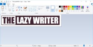
Well, I was prepared to try Photoshop, but MS Paint happened. So, Instead of fumbling with those innumerable photo editing tools, I launched the old and simple – but capable – Microsoft Paint and here’s the result –

Would you like to know the process?
The logo design process
OK, first draw a rectangle. You don’t need to know the precise size as you always can draw more lines and extend it further. By the way, the colour code I used is 413421 (Hex) or 65-52-33 (RGB). Now, pick the text tool and type the text you want there.

I have used the Impact font and the font size 64, for my design. You don’t need to bother about the alignment as the selection tool can help you get an approximate alignment. In the picture below, I used it to move the top side of the rectangle. Use the arrow keys for controlled movement.

I removed the part of the text that has to be transparent. Zoom in, make the required alignments and then add the separating line.

Now fill colour in the separated part. Pick up the white colour and type in the text. I will solve the problem of transparency later.

Yes, my rectangle fell short of space there. Let’s increase the length. You have to undo the newly entered text. And then, add the extra lines.

Okay, all is good until now. You don’t need precision as the unwanted part can be erased off later. Now, fill colour in it and see how seamlessly both the areas become one. Next, type in the white text.

Now it’s time to pick the Eraser tool. Remove the unwanted part, play with the selection tool and align your text to box properly. The hard part is over and here is what you get.
Save your design. The picture you saved has a white background, and you need a transparent one, right? Let’s help you achieve that.
Remove background
I used the online photo editing tool, LunaPic to remove the white background and get a transparent one. It’s a quick one, no hard work required.

Select the Upload button and upload the saved picture. After the upload is complete, go to Edit >> Transparent Background.

And click on the colour you want to remove, White, in our case. And you get this –

Yes, the watermark is ready. Save it and insert it in any picture you want.
If you want to see the watermark at work, here’s an example –

So, what do you think about the process? Is it easy? Waiting for your feedback!
If you're going to make one and didn’t understand any step, feel free to ask. :)